
Each section shows a component, its main variations, and a note on when to reach for it. The list below is itself a live Table of Contents block.
Component library
A working reference for the custom EDCH blocks: every component, its main variations, and when to use each.
Content with Media
A 50/50 row pairing a block of text with an image (or video). Use it to give a single message a supporting visual, and alternate the image side down a page to create rhythm. Options: which side the media sits, panel background, image shape, and wide vs full width.

Image right, no background
The default. Text on the left, a square image on the right, no panel. Reach for this as your everyday text-and-image row.

Image left, sand panel, portrait
Flip the image to the left and drop it on a sand panel. Alternating the side on consecutive rows keeps a long page feeling lively. Portrait suits people and pets.
Dark panel, landscape, with button
A dark green panel with a landscape image and a call to action. Good for a high-impact moment – the button automatically switches to white on dark.

Full width, green
Set width to full and the panel spans edge to edge instead of the content column. Use sparingly for a section that should break out of the normal grid.
Numbered Steps
A sequence of numbered points. Each step is a card with its number badge inside, so the card lines up with the rest of the library. Use the stacked layout for a genuine step-by-step, or the grid layout for shorter, parallel points. Each step can carry an optional button.
Stacked (light)
The default. Use for a genuine step-by-step where order matters.
-
1
Add your steps
Three to six reads best. Keep each title short.
-
2
Write a short description
A sentence or two under each title keeps it scannable.
- 3
Grid, 2 columns (sand)
Grid lays steps out in equal-height columns on desktop. Use when the points are parallel rather than strictly sequential.
-
1
Switch layout to Grid
Stacked becomes a column grid above the desktop breakpoint.
-
2
Choose 2 or 3 columns
Two columns suits longer descriptions.
-
3
Stacks on mobile
Always collapses back to a single column on small screens.
-
4
Numbers stay
Each card keeps its number badge.
Grid, 3 columns (dark green)
Three columns for short, punchy points on wide pages. Light text on the dark panel.
-
1
Keep titles tight
Three columns leave less room.
-
2
Great for features
Use for a row of benefits or highlights.
-
3
Short descriptions
A sentence each is plenty.
Table of Contents
A manual list of jump links for long pages. Pair it with the Anchor block, which you drop above each target section (handy where a section has no heading to link to). Options: one or two columns, and any panel background. Rows without a link render as plain text.
Key Facts
A scannable strip of fact cards – an optional icon, a bold headline and a line of detail. Use it to pull out the handful of numbers or facts that matter most. The grid auto-fits (about four across on desktop, down to one on mobile). Shown below on every background.
Key Facts - Light grey
Light grey cards - the neutral default. Use it almost anywhere.
-
Scannable highlights
Pull out 3-4 key facts or numbers.
-
Optional icons
Pick an icon per fact, or leave it off.
-
Auto-fit grid
Wraps from four across down to one.
-
Any background
Switch the panel colour to suit the page.
Key Facts - Sand
A warm sand panel. Soft and editorial; nice for storytelling sections.
-
Scannable highlights
Pull out 3-4 key facts or numbers.
-
Optional icons
Pick an icon per fact, or leave it off.
-
Auto-fit grid
Wraps from four across down to one.
-
Any background
Switch the panel colour to suit the page.
Key Facts - Green
The brand green panel. Bold and eye-catching - keep the copy short.
-
Scannable highlights
Pull out 3-4 key facts or numbers.
-
Optional icons
Pick an icon per fact, or leave it off.
-
Auto-fit grid
Wraps from four across down to one.
-
Any background
Switch the panel colour to suit the page.
Key Facts - Dark green
Dark green with light text. High contrast, good for emphasis.
-
Scannable highlights
Pull out 3-4 key facts or numbers.
-
Optional icons
Pick an icon per fact, or leave it off.
-
Auto-fit grid
Wraps from four across down to one.
-
Any background
Switch the panel colour to suit the page.
Key Facts - No background
No panel - the content sits directly on the page background.
-
Scannable highlights
Pull out 3-4 key facts or numbers.
-
Optional icons
Pick an icon per fact, or leave it off.
-
Auto-fit grid
Wraps from four across down to one.
-
Any background
Switch the panel colour to suit the page.
Do’s & Don’ts
Two side-by-side lists – green ticks for the do’s, red crosses for the don’ts. Use it for quick, contrasting guidance. The column labels are editable, so it doubles as any “this not that” comparison.
Default labels
The standard "Do / Don't" pairing. Keep each item to a single line.
Do
- Keep each item to one line
- Use parallel phrasing
- Aim for 3-6 per side
Don't
- Write long paragraphs
- Mix unrelated topics
- Leave one side empty
Custom labels
Rename the columns to fit the context - here, "Best for / Avoid".
Best for
- Quick scannable guidance
- Before / after comparisons
- Settling-in or care tips
Avoid
- Nuanced, caveat-heavy advice
- Anything needing long explanation
- More than one idea per item
Warning Signs
The same scannable grid as Key Facts, but with a caution-styled icon badge. Use it for “watch out for…” content – symptoms, risks, red flags. Shown below on every background.
Warning Signs - Light grey
Light grey cards - the neutral default. Use it almost anywhere.
-
Caution badge
Each item gets a coloured alert icon.
-
Scannable grid
Same auto-fit grid as Key Facts.
-
Any icon
Draws on the shared icon library.
-
For risks
Best for symptoms and red flags.
Warning Signs - Sand
A warm sand panel. Soft and editorial; nice for storytelling sections.
-
Caution badge
Each item gets a coloured alert icon.
-
Scannable grid
Same auto-fit grid as Key Facts.
-
Any icon
Draws on the shared icon library.
-
For risks
Best for symptoms and red flags.
Warning Signs - Green
The brand green panel. Bold and eye-catching - keep the copy short.
-
Caution badge
Each item gets a coloured alert icon.
-
Scannable grid
Same auto-fit grid as Key Facts.
-
Any icon
Draws on the shared icon library.
-
For risks
Best for symptoms and red flags.
Warning Signs - Dark green
Dark green with light text. High contrast, good for emphasis.
-
Caution badge
Each item gets a coloured alert icon.
-
Scannable grid
Same auto-fit grid as Key Facts.
-
Any icon
Draws on the shared icon library.
-
For risks
Best for symptoms and red flags.
Warning Signs - No background
No panel - the content sits directly on the page background.
-
Caution badge
Each item gets a coloured alert icon.
-
Scannable grid
Same auto-fit grid as Key Facts.
-
Any icon
Draws on the shared icon library.
-
For risks
Best for symptoms and red flags.
Trainer’s Tip
A callout for a short piece of advice or a quote from a person, with a name, role and an optional round photo. Use it to add a human, expert voice. Shown below on every background, alternating between with-photo and no-photo.

Trainer's tip - Light grey
Light grey cards - the neutral default. Use it almost anywhere. Add a name, role and an optional photo to give advice a face.
Jane Mackay EDCH behaviourist (with photo)
Trainer's tip - Sand
A warm sand panel. Soft and editorial; nice for storytelling sections. Add a name, role and an optional photo to give advice a face.
Jane Mackay EDCH behaviourist (no photo)

Trainer's tip - Green
The brand green panel. Bold and eye-catching - keep the copy short. Add a name, role and an optional photo to give advice a face.
Jane Mackay EDCH behaviourist (with photo)
Trainer's tip - Dark green
Dark green with light text. High contrast, good for emphasis. Add a name, role and an optional photo to give advice a face.
Jane Mackay EDCH behaviourist (no photo)

Trainer's tip - No background
No panel - the content sits directly on the page background. Add a name, role and an optional photo to give advice a face.
Jane Mackay EDCH behaviourist (with photo)
Now available on every page type
These blocks already shipped with the theme but were limited by content type – Accordion and Latest News were on Pages only, and Intro / Blockquote was not enabled anywhere by default. They are now available everywhere the component picker appears: Pages, Posts, Articles, Events and Advice Articles. (Content with Media, shown at the top, is part of this group too.)
Intro / Blockquote
One block, two looks. Leave the citation empty for a large intro paragraph; add a citation to turn the same block into a pull-quote. Use the intro to lead into an article, the blockquote to feature someone’s words.
With no citation, this block renders as a large intro paragraph - a friendly lead-in at the top of an article or page.
Add a citation and the very same block becomes a pull-quote - perfect for featuring a supporter or adopter.
The blockquote form
Accordion
Collapsible rows for FAQs or longer reference content you want to keep tidy. Each row opens and closes; keep titles short and answers focused.
Is this available on articles now?
Yes. The Accordion used to be limited to Pages – it now works on Posts and Articles too.
What should I use it for?
FAQs, care guides, or any content that benefits from being scannable and expandable.
How many rows is sensible?
As many as you need, but group related questions so it stays easy to scan.
Latest News
Automatically lists the most recent articles – no manual picking. Drop it near the foot of a page to surface fresh content. Now available on Posts and Articles as well as Pages. (If nothing shows, there are simply no published articles yet.)
Latest news
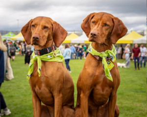
Community Day 2026
A huge thank you to everyone who came along to Community Day 2026. Here are some of our highlights from the day.
Read Article

Rudy's story
When he was rehomed from us in 2024, Rudy's boisterous behaviour left new owner, Hanna, with a lot on her plate. He was so destructive that she thought she might have to return him to us.
Read Article